Talent and Attractiveness
Do attractive people tend to be less talented?
Look at the following graph which shows the relationship between indices of attractiveness and talent for a sample of celebrities.
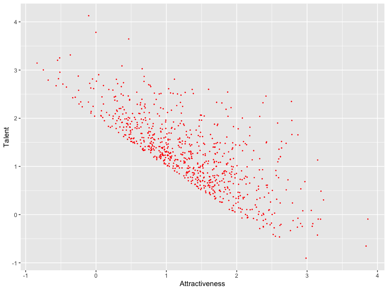
It’s immediately evident from this graph that celebrities with the highest measure of attractiveness tend to have lower measures of talent, and vice versa. That’s to say, there’s a strong negative correlation between the two variables. Indeed, the correlation coefficient for these data, which would be zero if there were no relationship at all and -1 if there were a perfect negative relationship, is -0.73.
So, should we conclude that generally people that are more attractive tend to be less talented?
Actually, no, and the key to this question is in the way the sample has been selected.
The data in the above figure were actually selectively sampled from a wider population in which there is no relationship between talent and attractiveness. How do I know? I simulated the data. Here they are:
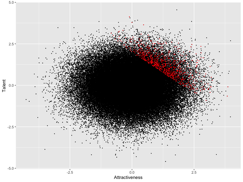
I assumed that celebrities become celebrities because they have some reasonable combination of talent and attractiveness. In this simulated example, I assumed that the sum of their indices of talent and attractiveness was at least 2. Not all such individuals become celebrities, so I randomly sampled 10% of the individuals who satisfy this criterion. These are shown in red in this diagram, and it’s the extraction of just these individuals that is shown in the previous diagram.
Clearly from the second figure, there is no relationship at all between attractiveness and talent in the wider population – however attractive you are, you’re just as likely to be talented or untalented. The observed correlation coefficient is actually 0 to 4 decimal places. But as we saw above, if we limit the analysis to a subset of individuals whose combined and attractiveness exceed some threshold, there’s a very strong negative correlation between the variables.
This phenomenon is known as Berkson’s paradox.
A Game of Two Half Seasons
Here’s another example in a football context. Suppose we’re interested in how Premier League clubs perform relatively in the first and second half of the season. I’ve selected some clubs in the Premier League over the period from 1995 – 2023 – a period in which the structure of the League remained constant – and plotted the first and second half of season points totals for these teams. This is shown in the following figure:
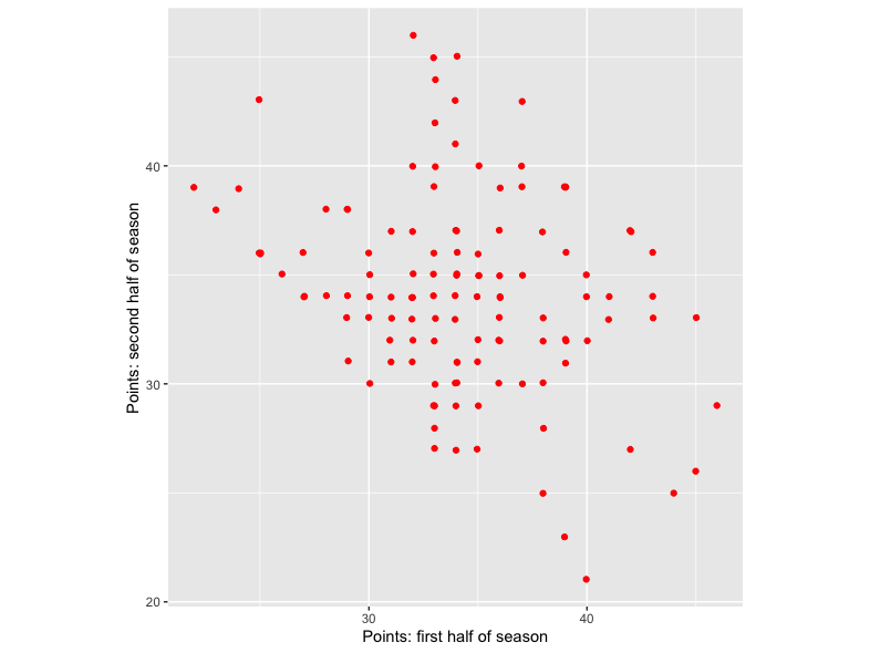
Again, there’s a negative relationship between the two variables: teams that do well in the first half of the season do poorly in the second half and vice versa. But this contradicts common sense: surely the best teams in the first half of the season also tend to be the best teams in the second half of the season? And similarly for the worst teams. How come the opposite seems to be true?
This again is Berkson’s paradox. The analysis above was actually based on the set of teams who do reasonably, but not fantastically, well in a season. Specifically, I selected all teams who had scored between 60 and 80 points in a season.
If instead we look at the relationship between first and second half of season points for all teams, we see the kind of relationship you’d expect:
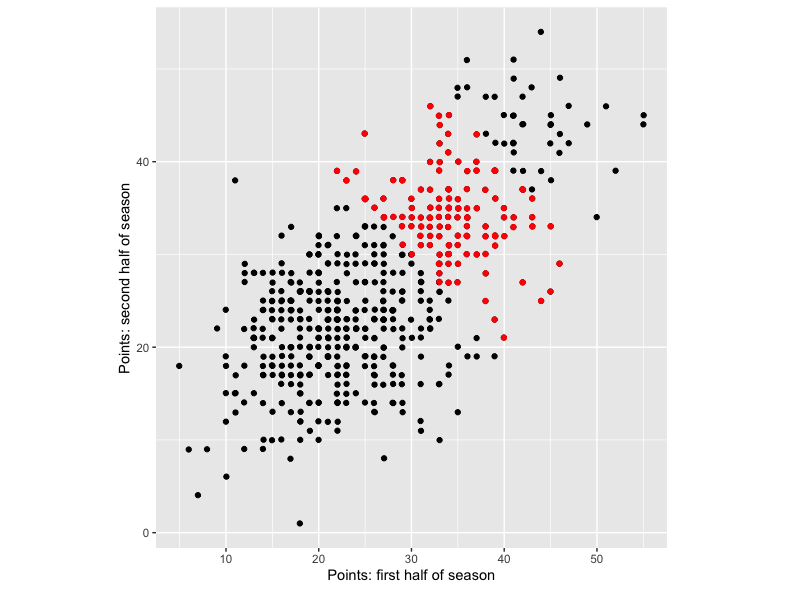
Across all teams there’s a tendency for teams who do well in the first half of the season to also do well in the second half. But if we extract only the teams scoring between 60 and 80 points over the whole season, we get the previous graph with an apparent negative relationship. These teams are shown in red in the latter graph. As we saw in the previous figure, in isolation they exhibit a negative trend. But as we now see from the second figure, they actually form part of a general positive trend across the wider population of teams.
If you think carefully, this effect is maybe very obvious. The teams that do moderately well over a season won’t be the ones that did well in both halves of a season – otherwise they’d be near the top – or the ones that did badly in both halves – otherwise they’d be near the bottom. The selection process means we’re dropping teams who’ve done well or badly in both halves of the season. It’s therefore bound to be the case that for the ones that are left, they will have done well in one half of the season, but not the other, leading to the negative relationship that we’ve observed.
Other Settings
Though the manifestation of Berkson’s paradox is perhaps obvious in the two examples cited above, it’s maybe less obvious in other settings. For example, it’s common to study data on hospitalised patients to try to understand inter-relationships between different disease types. But Berkson’s paradox often leads to misleading negative correlations between disease rates among such patients.
For example, consider 2 diseases that we’ll label X and Y. If a patient doesn’t have disease X they’re more likely than a non-hospitalised person to have disease Y since they must be in hospital for some reason (which could be that they have disease Y). By conditioning on the members of the population who are in hospital, and therefore are more likely than average to have either X or Y, we inadvertently induce a negative correlation between the disease rates, even though such a relationship doesn’t exist in the wider population. This is essentially the setting in which Berkson first discussed the phenomenon.
Conclusion
There’s nothing very mysterious about Berkson’s paradox, which actually seems very obvious when given a little thought. Nonetheless, it highlights one of the biggest dangers when undertaking any statistical analysis: finding a relationship that exists for a subset of individuals and assuming that same relationship will hold for a wider population. The unique aspect of Berson’s paradox is when the variables of interest themselves – attractiveness/talent, first half/ second half season points – are used to define the study sample. In that case, not only is there a risk of relationships not extrapolating to the wider population, but it’s a mathematical certainty.
Postscript
The data from the analysis of first and second half points totals above can also be used to illustrate another phenomenon that we’ve discussed before in this blog. The following figure shows the difference in points from the 2 halves of the season – second half of season points total minus first half of season points total – plotted against the first half points count.
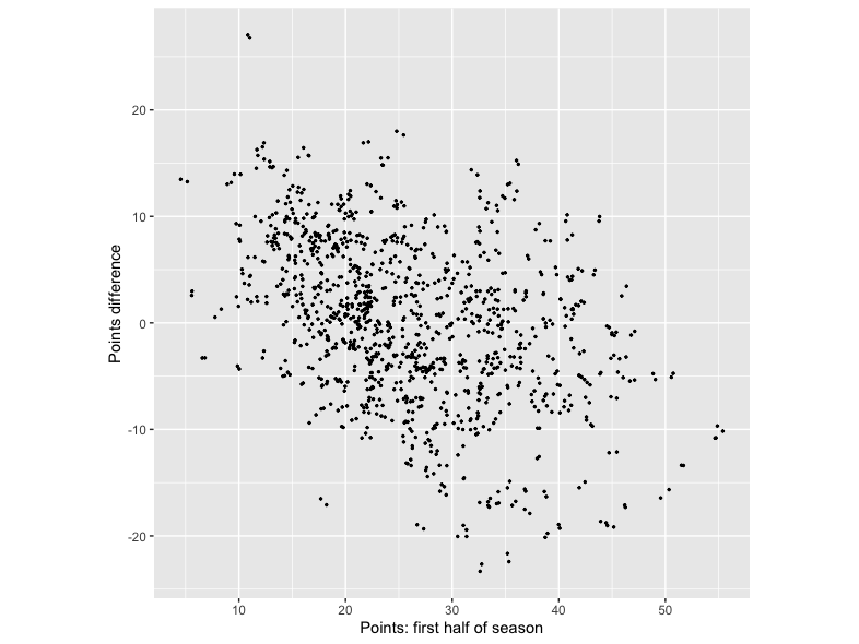
What we see is that teams who scored relatively few points in the first half of a season tend to have a positive points difference. That’s to say, they tend to score more points in the second half of the season, By contrast, teams who did well in the first half of the season tend to do less well in the second half, leading to a negative points difference. This is the ‘regression to the mean’ effect discussed in an earlier post. In outline, teams’ point scores in any period are likely to be due to a combination of skill and luck. Teams with the most points in the first half of the season are likely to be the moist skilful, but also to have been reasonably lucky. They’ll most likely be skilful in the second half of the season as well, but chances are they’ll be less lucky. (If you roll a dice and get a 6, you are more likely than not to be less lucky when you roll the dice again). As such, their second half of season points total is likely to be lower. For teams at the other end of the scale it’s the same story in reverse.