A complication when looking at country-by-country numbers of Coronavirus cases or deaths is the effect of regional variations. Although China was badly affected at the start of the pandemic, it managed to pretty much contain the virus to the single region of Hubei, with the rest of China mostly unaffected. This clearly had little to do with the size of the different regions or other socio-geographic reasons, but was due to the travel and other restrictions that were imposed to limit the spread of the virus.
Similarly in Italy. The outbreak started in Lombardia, and spread to neighbouring regions before controls were put in place. The following graph compares the number of cases through time – up till 13th May – in the 5 worst affected regions of Italy, which happen to include Lombardia and its neighbours. As you can see, even among these 5 regions, there are very big differences. Lombardia has had roughly the same number of cases as the other 4 regions combined, and at 394 continues to have the highest number of new cases (though Piemonte, which includes Torino, has a slightly higher rate of increase). Comparisons against the other 15 regions of Italy would show even bigger differences of course.

In one sense, having the majority of cases in a single location is a very big disadvantage: the pull on health resources in that location at the height of the epidemic will be enormous. And it’s pictures and stories from hospitals in Lombardia which were a wake-up call for many people about the dangers of this epidemic.
In another sense though, there’s a big advantage in localising the epidemic. If all cases are in one place, and you can stop transmission to other places, then the number of potential victims is much reduced. This is most evident from the China experience. China has a population of around 1.4 billion. But by effectively cutting off transmission from Hubei, with a population of around 60 million, to the rest of China, the risk to the majority of the country was almost eliminated. Had the same number of infected people been spread around China rather than concentrated in Hubei, the whole population would have been at much higher risk.
With all this in mind, I’m grateful to Ian for sending me this link which allows a comparison of various aspects of UK Coronavirus data by either region or age. Here, for example, is a screenshot of the trajectory of the total number of cases in London and 3 other regions. The vertical blue line corresponds to the date at which the UK was placed under lockdown; the vertical red line is the date at which the graphs were produced (10th May). The article itself includes other regions and the option to switch to other types of data – daily cases, death counts, etc.
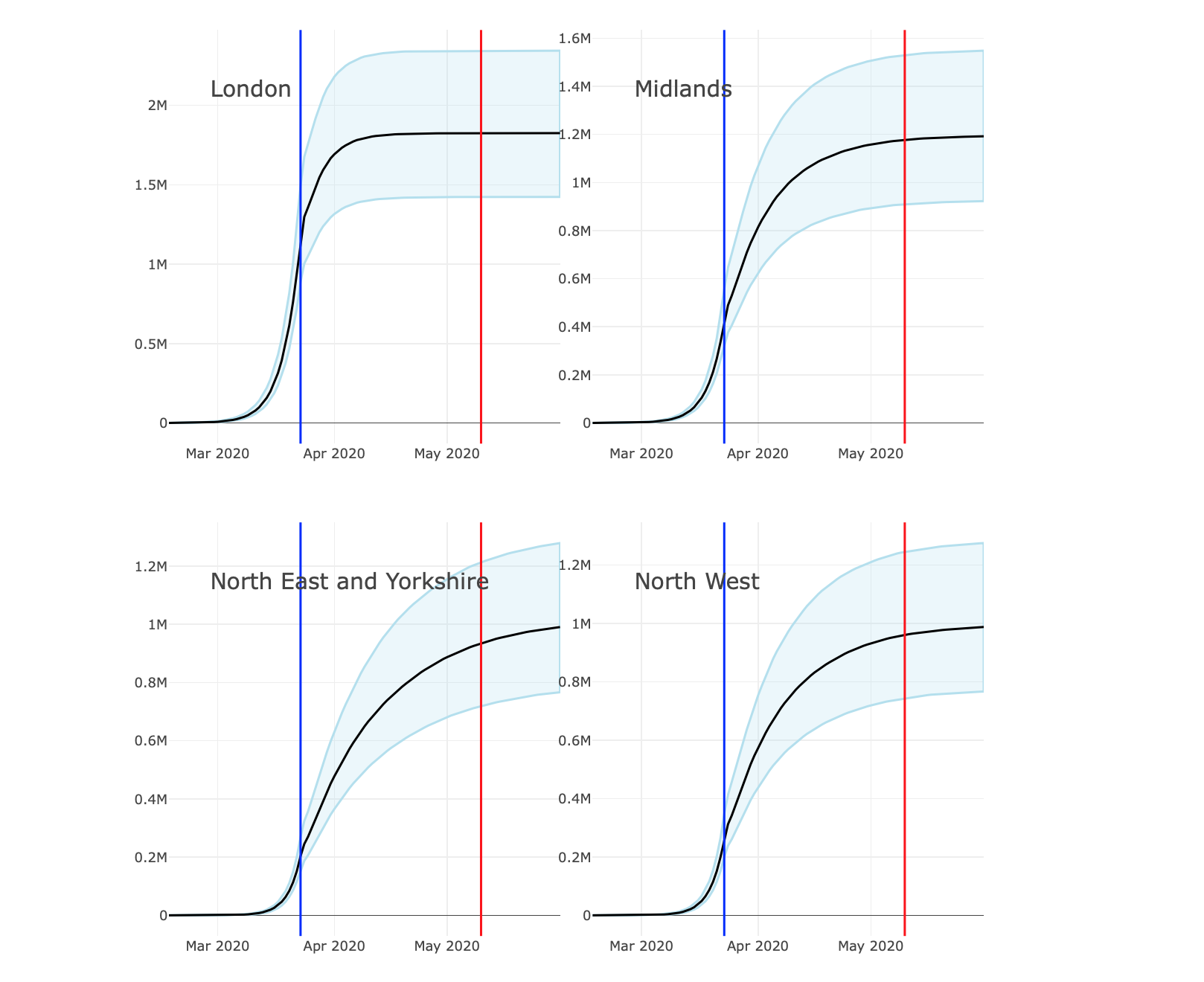
There are some aspects of these figures that I don’t fully understand, which I’ll discuss below. But focus on the black curve, which is a smoothed value of the total number of cases on each date in each region. It’s a little higher in London and, to a lesser extent, the Midlands, but is of the same order of magnitude in each of the regions. Also, although the curve seems to have stabilised in those 2 regions, it seems to still be growing in the North East and North West, so it’s likely they’ll all end up with similar numbers. But the point is, there is no evidence of any local containment. Rather the virus seems widely spread at similar levels across the whole country.
As discussed above, this is good news in terms of health resources: demand is evenly spread across the whole country, avoiding the type of pressures that occurred in Lombardia. But the downside is that containment is likely to be much more difficult. Travel between regions in Italy is currently much more highly restricted than travel within regions, and you can see why this is an effective policy if the vast majority of cases are in Lombardia. In the UK, where the cases are much more widely dispersed, it’s clear that a strategy of this type would be of very little benefit.
On a rather more positive note, the above link also provides an estimate of the infected transmission rate – the ubiquitous R – through time for each region. Clearly, the lockdown has been effective in reducing R below the critical value of 1 in each of the regions.
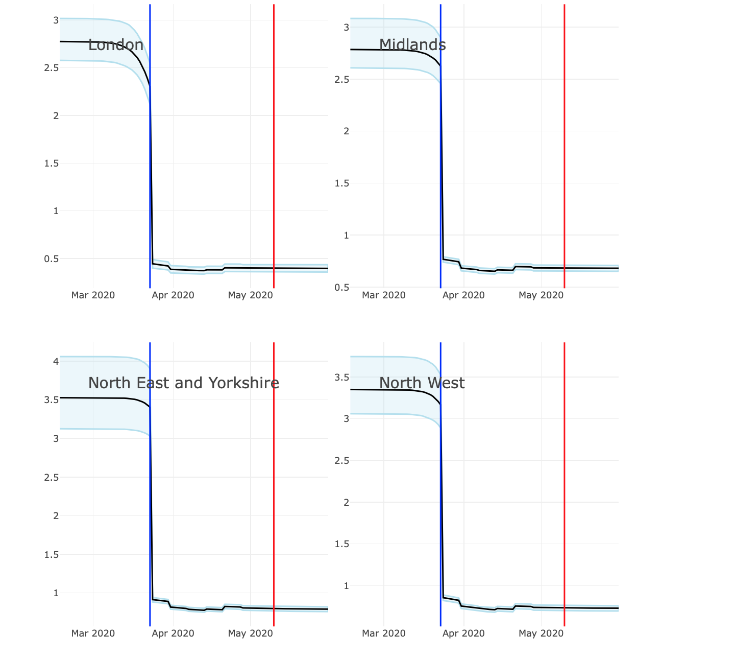
The big question, of course, is how these values will change as the lockdown restrictions are gradually loosened. And a concern for the UK, because of the regional uniformity of numbers, is that similar changes as made in the countries will have a bigger impact on the value of R.
The report linked to above that contains the UK regional analysis was produced by the COVID-19 Working Group, which is part of the MRC Biostatistics Unit, which in turn is part of Cambridge University. It’s therefore likely to be high quality and reliable.
That said, there are some aspects of the graphs above that I find a bit puzzling. In both sets of graphs the shaded blue regions are so-called 95% credibility intervals. You can interpret these as meaning that the true value, of which the black curve is a kind of ‘best estimate’, will lie within the blue shaded region with probability 95%. Even more loosely: the black curve is the best estimate, but allowing for variations in sample data, the truth can only really be assumed to be anywhere within the blue shaded region.
What I don’t really understand with the first set of figures is why there is just as much uncertainty – as measured by the size of the blue shaded region – in the period going forward from the red line, as there was in the past where we have pretty much complete data. Usually, forecasts have much bigger credibility intervals because of the manifest unknown in how the future will behave.
That’s also an issue with the second set of figures on R, but there I have a more fundamental question. Is it really the case that you can identify from the data such a sudden change in R from above 3 to below 1 on exactly the day the lockdown was introduced? It will be a smart piece of Statistics if that’s really the case, but I’m doubtful. Empirical counts of new cases changed only very gradually around the date of the lockdown, so I find it surprising that a statistical model could pinpoint a big change so accurately.
The report includes mention of a ‘Methods Section’, but that seems to be missing, so I haven’t been able to investigate these aspects further.