As referred to in an earliest post, it’s been understood from the start of the epidemic that testing for Coronavirus is crucial for limiting its initial spread and as a way of mitigating against a second wave once the first wave has been brought under control. It seems reasonable therefore, at least in part, to judge the efficacy of a government’s response to the crisis by the extent of their testing regime. So how does the UK compare against other countries in this respect? Though it’s not the whole picture we can look at some statistics across countries.
This is a graph of the total number of tests per 1,000 people carried out through time for a number of countries:
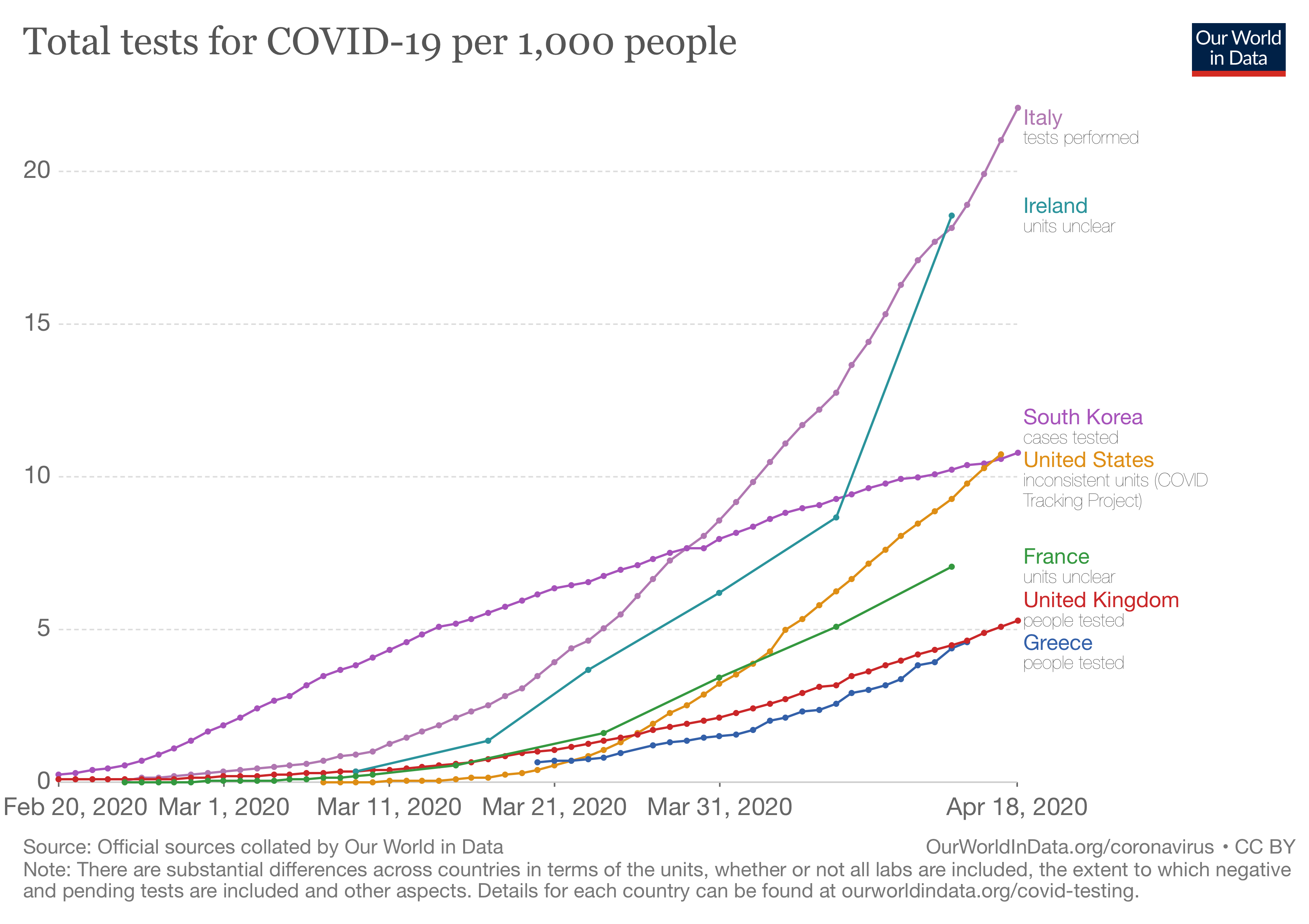
Some of the main points are:
- Even allowing for the fact that South Korea had a number of cases before most other countries, it carried out a large number of tests early on in the crisis. This is almost certainly one reason that it has been relatively successful in containing the epidemic, and has not needed to massively extend its testing capacity in recent weeks.
- Italy’s outbreak started later than that of South Korea, but even allowing for that, it was slower in developing its testing capabilities. More recently though it has developed an extensive testing framework.
- The US was extremely slow in ramping up testing facilities, though in recent weeks it has started to do much better.
- The UK and Greece continue to have relatively limited numbers of tests. However, Greece has been commended for tackling the epidemic through other fast and decisive measures; the UK less so.
Another way of looking at the numbers is as a single snapshot of the test numbers – this time per 1 million capita – as of a couple of days ago.
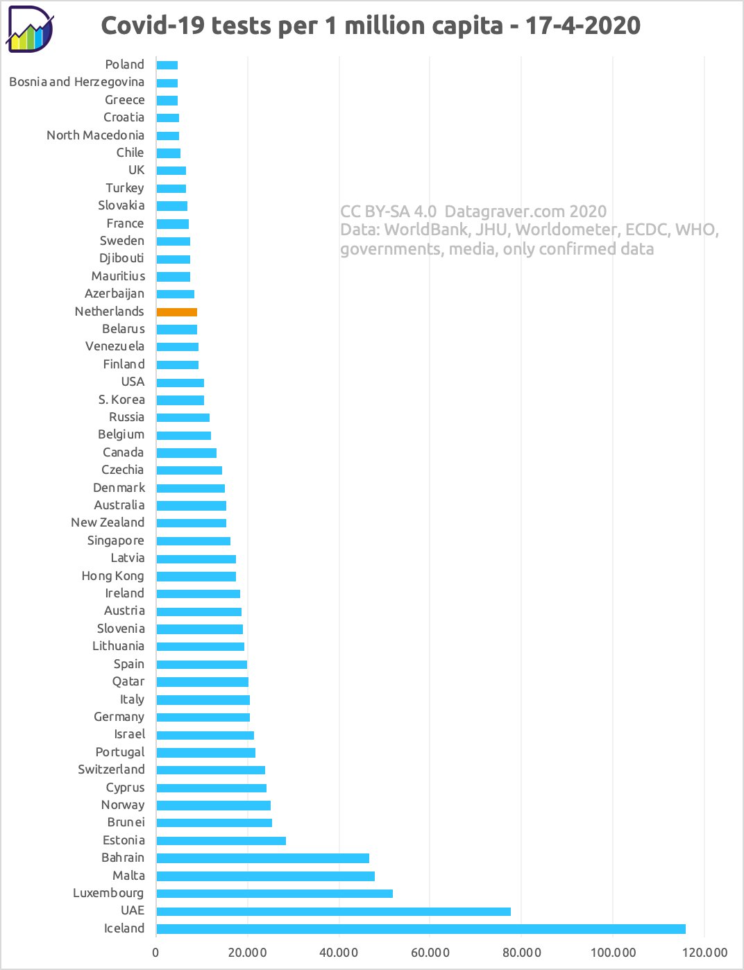
It’s maybe no surprise that the UK is unable to match a country with a far smaller population like Iceland, but less clear why it can’t match Ireland, Italy or Germany.
But what about the relationship between testing and infection rates? The following graph compares per capita test rates against per capita case numbers:
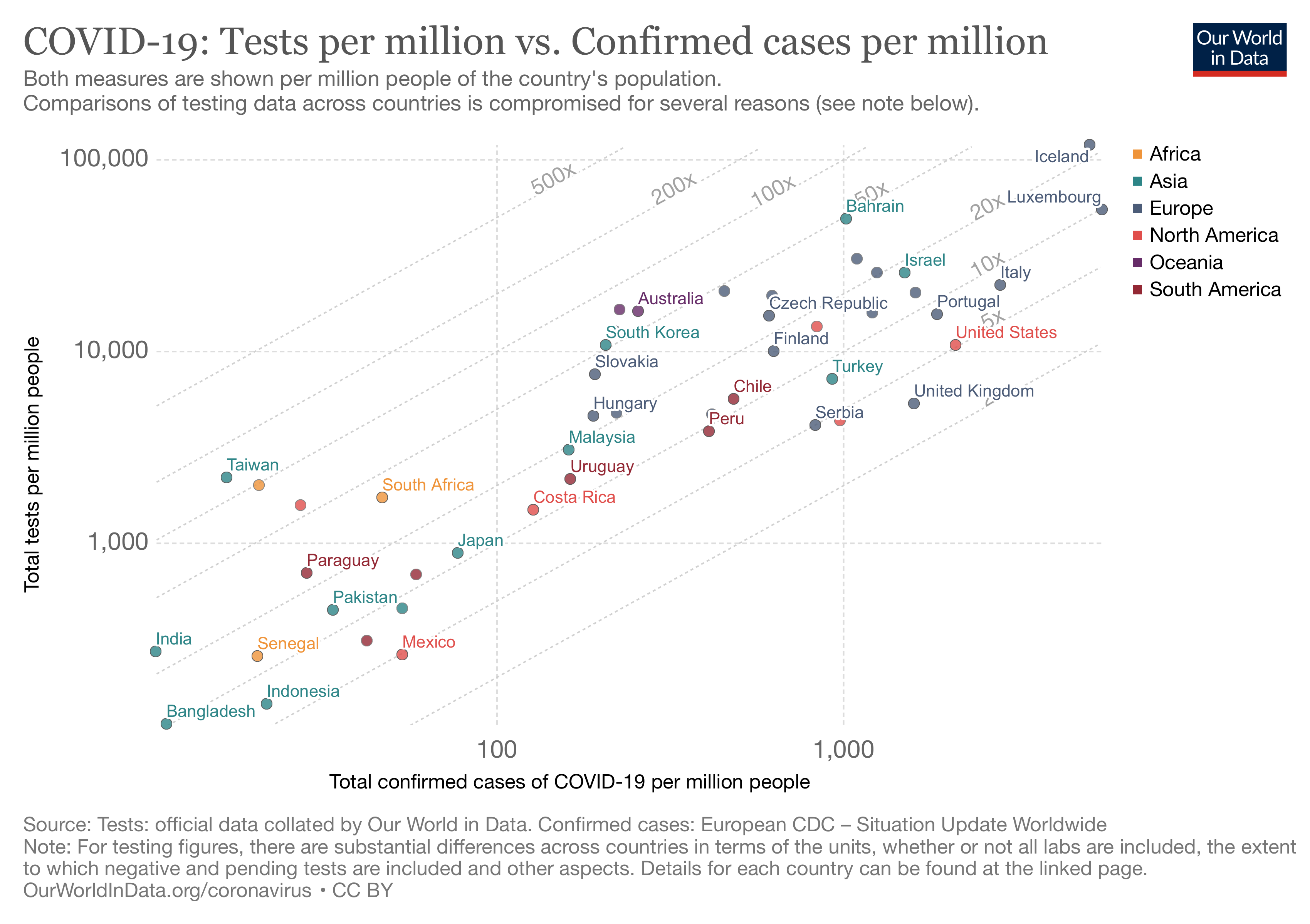
Interpretation is not completely straightforward. One might hope that more tests per capita lead to a better control of the epidemic and therefore fewer cases per capita. But equally, countries that have so far had relatively few cases are likely not to have built up an extensive testing network yet. Also, a country that carries out more tests is likely to identify more positive cases.
Nonetheless, there are a number of takeaway points:
- Though Iceland does the most tests per capita, it also has a large number of cases. But, as explained above, one reason it has more confirmed cases is likely to be simply because it’s done more tests. Moreover, Iceland has been praised for tackling the epidemic through a rigid contact tracing and isolation regime, and has been successful in keeping the number of deaths very low (currently just 9).
- Italy, similarly, has a large number of cases despite carrying out many tests. Again, this will be partly because more tests are likely to lead to more cases, but is likely to be more strongly influenced by the fact that Italy was the first European country to be badly affected by the epidemic. It therefore had less evidence with which to decide how best to respond to the outbreak and was therefore relatively slow in ramping up testing. Furthermore, Italy is further ahead in its trajectory than other countries, so in future versions of this graph, other countries are likely to move further to the right than Italy does.
- Though South Korea has kept its number of cases fairly low – especially for a country that was affected early on in the pandemic – its actual testing capacity is no greater than that of the US. However, as we saw in the earlier graph, its initial testing response was very much quicker. So, it’s not just the number of tests that’s important, it’s the speed with which the testing framework is put in place.
- For countries with a large number of cases, the UK is weakest in terms of the number of tests. This won’t be the only reason it has a large number of cases per capita, but it’s likely to be one of them.
In summary, based purely on the statistical evidence, the UK comes out relatively poorly compared to many other countries in terms of its response to the Coronavirus epidemic through building a platform for population testing.
One caveat. The fine print in each of these graphs makes clear that comparison across countries is not completely fair. Data are collected and recorded in different ways in different countries. For example, in the UK numbers are on people tested; in Italy they are on the number of tests carried out. This is likely to make some difference, as people who test positive are likely to be subsequently tested again to ensure they are negative. This would apparently count as 2 tests in the Italy data, but only 1 in the UK data. However, most test results come back negative. In Italy, for example, the rate of positive tests is around 13%. So, although the difference in data protocols might explain some of the difference in the UK and Italy numbers, it doesn’t explain most of it.