Look at the following graphic of the number of Coronavirus fatalities through time in various countries.
It’s live, so the version you see is likely to be different from the current one I’m looking at. It’s extremely informative though: you can run it as an animation to see how things have changed over time; you can select the countries you’re interested in comparing; you can highlight individual countries by hovering over the graph with the cursor; and you can switch between logarithmic and linear scales.
There’s one issue I’d like to focus on. So we’re looking at the same version of the graph, I’ve taken screenshots on 19th April. I’ve also restricted the comparison to the US, Spain and the UK, and I’ve moved over to a linear scale.
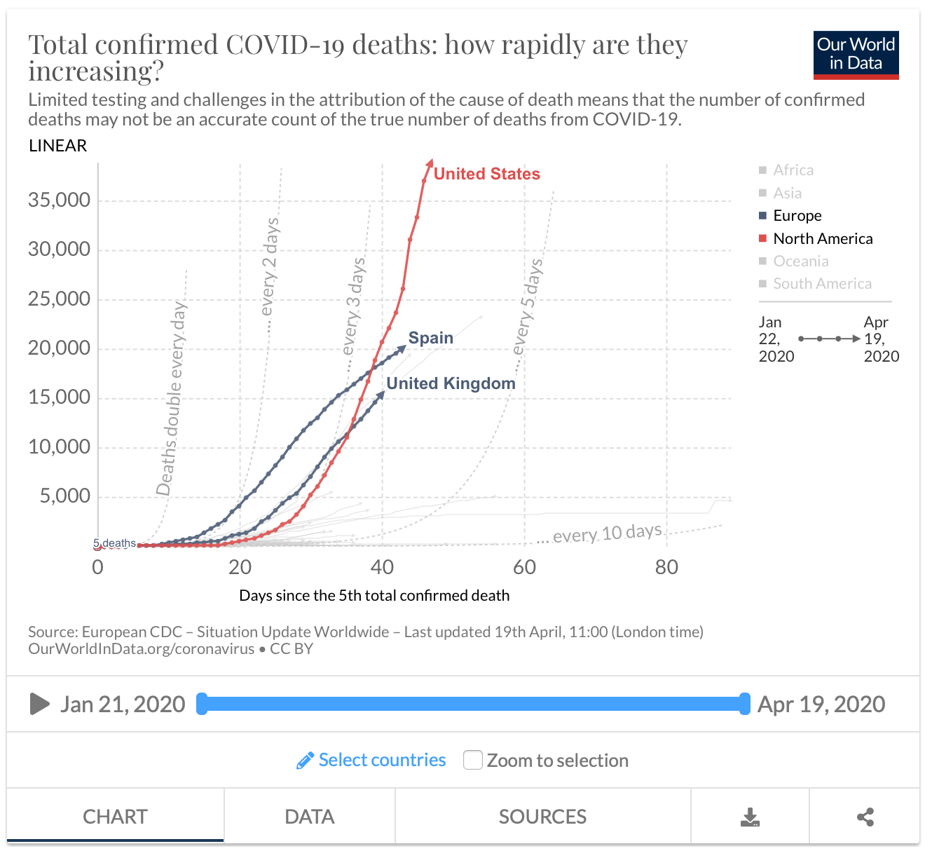
As you can see, the epidemic took off earlier in Spain, but the trajectory there is starting to flatten even on this linear scale. The UK seems to have moved from a phase of exponential growth to a phase of linear growth, while numbers in Spain and the UK are now dwarfed by those of the US, whose growth rate is also now close to linear, but at a much steeper rate than that of the UK.
But, the US is a much bigger country than either Spain or the UK, and with a much larger population: isn’t it to be expected they have a much higher death rate? Well, here are the same data but shown per million of population.
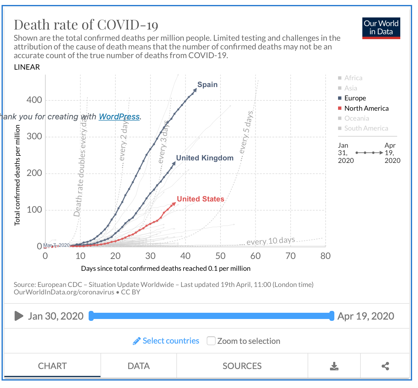
The shapes of the 3 curves are unchanged, but the levels are completely different. On this scale, the US is much less affected than either the UK or by Spain, which fares worst of all.
Clearly, the two graphs give a quite different interpretation of how the 3 countries are performing in terms of containing the epidemic. So which gives the most accurate representation?
The answer isn’t straightforward, but we can use the epidemic calculator that I linked to in an earlier post to try to understand things.
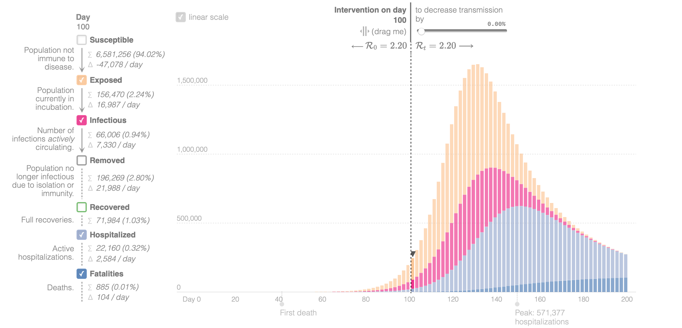
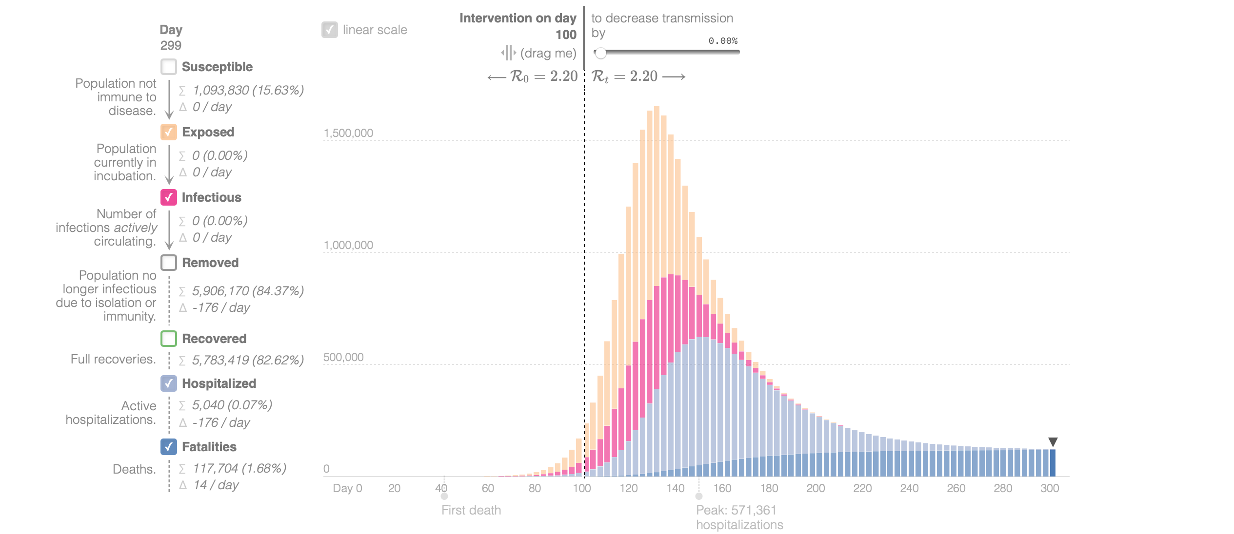
Look at the following screenshots from the calculator. I’ve used the default settings for transmission rates and so on, but changed the settings so that the transmission rate is constant throughout. in other words, this is how the epidemic is projected to behave without any kind of social restrictions or vaccine. To simplify things, focus on the fatalities which are shown in dark blue and tabulated at the bottom on the left. This first graph corresponds to what happens with a population of 7 million. After 100 days, as listed on the left, there are 885 fatalities.
The following graph is identical, but is based on a population of around 21 million, i.e. a country three times the size.
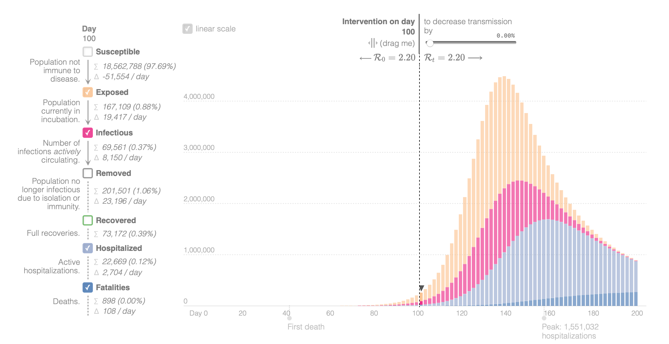
This time there are a predicted 898 fatalities after 100 days. So, even though the population is 3 times the size, there are just a handful more deaths. So, at this early stage of the epidemic, the size of the population has very little bearing on the number of cases or deaths.
But now, with identical settings, let’s compare the graphs towards the end of the epidemic:
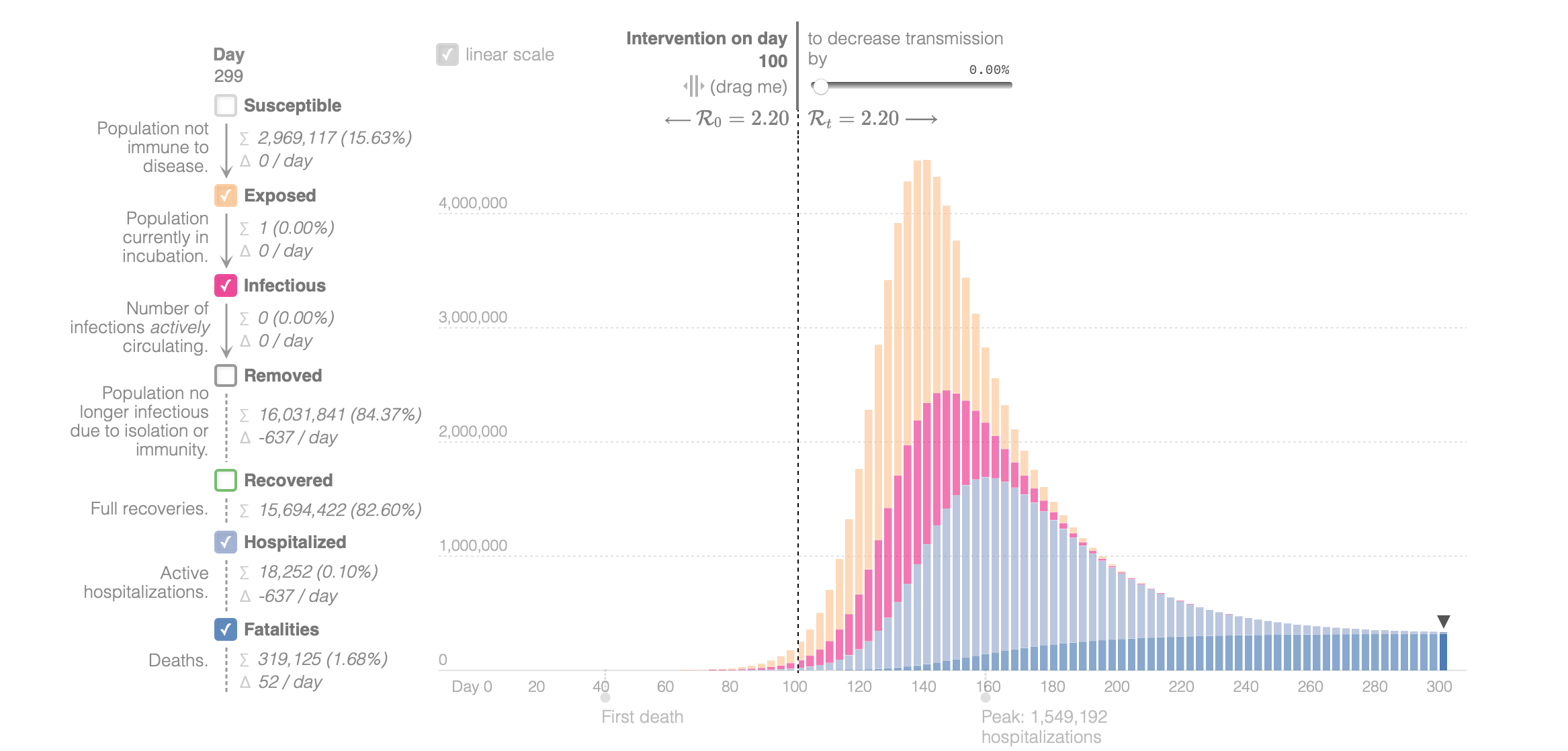
In the first case, again with a population of 7 million, there have been around 117,00 deaths, while in the larger population the number is around 3200,000, i.e. almost 3 times as many.
So, while in the short term, as the epidemic is growing, the size of the population has very little bearing on the number of fatalities, in the long run, the number of deaths are roughly proportional to the population size. In other words, at the start of the epidemic, there is no real basis for looking at numbers per capita of population: everything else being equal, large and small populations will have similar trajectories. But, as discussed in earlier posts, natural immunity is built up in a population as the proportion of infected individuals increases, leading gradually to a decline in transmission rates. And this will occur quicker in smaller populations.
What this all means is that towards the end of an epidemic, it makes more sense to look at numbers of fatalities per capita of population, but towards the start it’s more revealing to look at raw numbers.
A few comments:
1. Though the size of a population has little effect on the number of deaths in the early stages of an epidemic, the density of population very much will, since highly dense populations are likely to have a higher rate of transmission than those with a lower density.
2. The fact that a country comprises areas of high and low density population, with different degrees of interconnectedness complicates this argument further.
3. Another complication is to consider what happens after the introduction of social restrictions, which artificially reduce the transmission rate of the disease. You might like to try to guess what happens in that case, and then experiment with the epidemic calculator to see if you were right.
4. Notwithstanding the comments about interpretation, the figure at the top of this post, taken from Wikipedia, is a world map – as of 24 April – in which the colour intensity is proportional to the number of COVID-19 deaths per capita of population: the deeper the red, the greater the number of deaths per capita.
